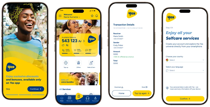
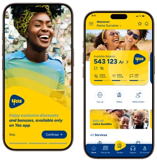
A telecom self-care application that enables users to manage their everyday telco needs in one place, from balance and data usage to payments, services, and account control.
The original dashboard was cluttered with over 40 distinct metrics on a single screen, leading to analysis paralysis for our core user base of financial analysts. Users reported spending an average of 5 minutes just to locate critical daily variance reports.
The lack of hierarchy meant that urgent alerts were often missed, resulting in delayed responses to market fluctuations. We needed to simplify the interface without removing the robust data capabilities that power users relied on.
"I feel like I'm fighting the software to find the one number I need every morning."
— Senior Financial Analyst, User Interview
Research & Discovery
Key Insights
Users prioritize "Daily Variance" and "Cash Flow" above all other metrics.
Dark mode is preferred for low-light trading environments.
Customization is key; no two analysts work exactly the same way.
Ideation & Wireframes
We started with low-fidelity sketches to rapidly iterate on layout concepts. The main goal was to establish a modular
grid system that could adapt to different screen sizes and user preferences.
Final Design
The final design utilizes a card-based UI with a customizable widget layer. We introduced a “Focus Mode” that collapses
secondary metrics, allowing analysts to zoom in on specific data points without distraction.
Adaptive Theming
Auto-switch based on market hours
and user preference.
Drag & Drop
Fully modular grid allowing users to
personalize their view.
Smart Alerts
Contextual notifications that don't
block the main view.
The Outcome
20%
Increase in Usage
Daily Active Users
3.5m
Faster Analysis
Avg. time to find key metric
4.8/5
User Satisfaction
Post-launch survey
"This redesign has completely transformed our morning workflow. The clarity of data is unmatched."